I’ve used elements of UX design in my work for years but felt it was worth broadening my knowledge of the whole UX process, and chose to do this through the creation of a photography app called FotoTip.
The app’s purpose would be to help amateur photographers produce better quality photos through technical guidance and inspiration. As a photographer myself, I know there are no hard and fast rules for taking the perfect picture, but alerts for perfect weather conditions, on-the-spot knowledge and inspiring example shots, would be something I would find useful and know others would too – and this is what formed the basis for my Unique Selling Point.
Market research
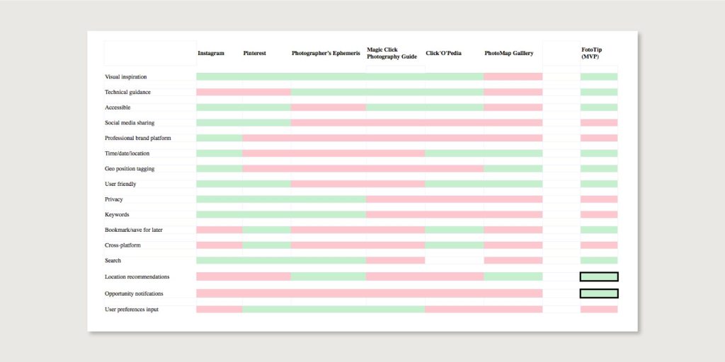
My competitive analysis showed that while numerous apps and companies offered either inspiration (Pinterest and Instagram) or technical guidance (Photographer’s Ephemeris and PhotoMap Gallery), very few offered both to a high standard. There really was a gap in the market for an app like FotoTip, and this helped guide me to what aspects I should prioritise when creating my Minimum Viable Product.
User interviews and personas
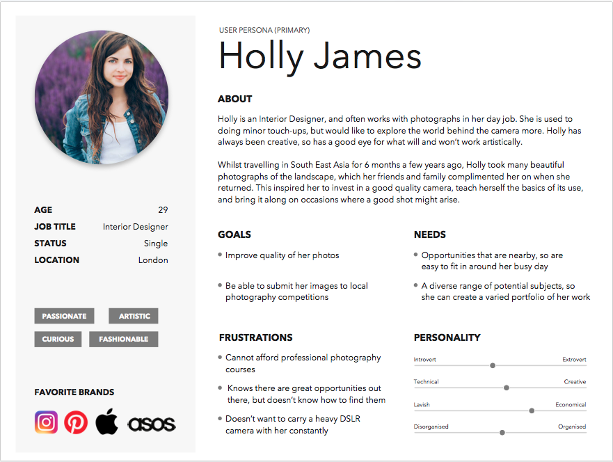
Helpfully I was also taking part in a photography class at the time of the app creation, so I conducted a number of user interviews with both the tutor and other course participants, and their insights provided essential insight into what both professional and amateur photographers would value in a photography app. The questions varied from specific to FotoTip and whether the interviewee would find value in an app of this type, to queries around their personal interest in photography – e.g do you plan your shoots in advance, how dpo you share your images, what brand of camera do you own.
These interviews helped me produce user personas (view here and here) based on who I believe the app would most appeal to, and what barriers they would likely have to using it.

User flows
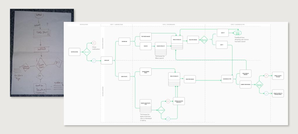
Once I had a clear user in mind, I began work on the app’s two clear user flows: inspire and action. The first draft of the user flow was created on paper to allow me to really focus on the most important aspects and not get bogged down by details, and this was followed by a mock up using post it notes on a wall so I could identify pain points and decide how I could link the two separate user flows together.
Finally, I created a detailed user flow in Sketch, which showed choice stages, filter options, and the 3 main stages of the whole process.
Wireframes and prototype
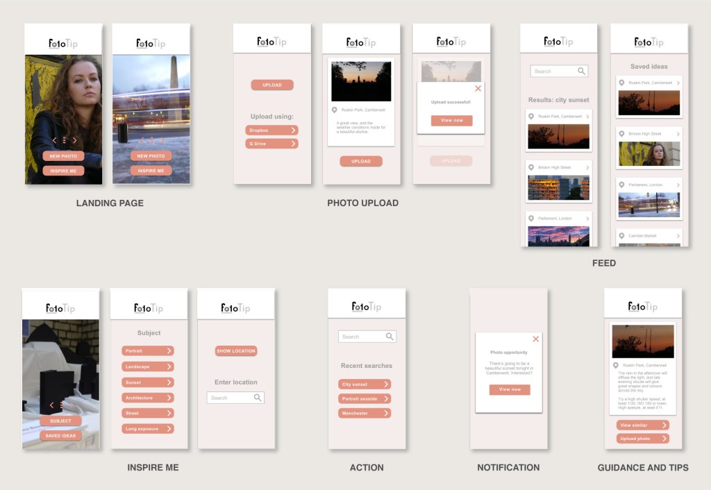
The first round of wireframes were quickly sketched out on paper to ensure the basic layout was easy to follow and navigate, and this was then followed by a series of digital wireframes and an interactive prototype using Sketch and inVision. After a series of usability tests and peer feedback, I produced the final high-fidelity wireframes.

